How Do You Make Users Stick Through Friction?
Every learning app is built on the same trap: the friction that makes it work is the same friction that makes people quit. You can't teach anything hard without the struggle, and the struggle is exactly what sends users somewhere easier. A classroom gets away with this — a timetable and a room full of people drag you back whether you feel like it or not. An app has to manufacture that pull itself, and every mechanism for it, from streaks to reminders, can counterfeit the learning as easily as create it. The real product was never the lessons. It's the gap between effort now and payoff later — and whether you can make that payoff feel close enough to be worth the struggle.
I'm building a learning app and it feels doomed to fail.
Learning needs friction — that stretch where a concept hasn't clicked yet and you have to struggle through the discomfort until it does. There's no version of learning something hard that skips this part. No app or AI tutor can completely remove it and still help you learn.
Which puts anyone building an education product in a strange position. Users need friction for your app to be effective - learning can't happen without it. But that friction is the same thing that makes them put the app down and never open it again.
A classroom doesn't need you to want to come back
A classroom solves this almost by accident. You show up to a 9am lecture because the room is on a timetable, because other people will be there, because skipping has a cost — not because you always want to. Whether you pay attention once you're in the seat is another question. You're in the seat. The material gets in front of you again, on a schedule you didn't have to generate yourself.

FIG.01 — A law lecture in Bologna, drawn around 1350. Half the room is talking or asleep — but they came, on a schedule none of them set, and the lesson got in front of them anyway.
![[src]](https://en.wikipedia.org/wiki/File:Henry_of_Germany_delivering_a_lecture_to_university_students_in_Bologna_by_Laurentius_de_Voltolina_(21114437820).jpg)
[src]
That last part matters more than it looks. Learning sticks through repetition — the same idea met again and again, spaced over weeks until it sets. One brilliant explanation doesn't do it. Twenty ordinary exposures do. And every one of those exposures depends on the learner coming back.
A classroom gets them back structurally. But an app has no built-in commitment device. Every return is a deliberate choice, made alone, against the day's resistance, with a hundred easier things one tap away.
The real product is the gap between effort now and payoff later
So the question that decides whether an education product works isn't whether the teaching is good. Plenty of teaching is good. The real question is whether someone comes back on an ordinary Wednesday, when the reward — a passed exam, a real skill — is still months off.
People discount the future. A reward that lands in March barely registers in November. That's not laziness — it's the wiring, and a product that asks people to beat their own wiring loses every time.
So the real product is a bridge across time. Its job: take a payoff that's months out and make a version of it land now — a flicker of progress, a signal you're moving — while the work underneath stays exactly as hard. The difficulty doesn't change. The only thing you can move is how far away the reward feels.
Every mechanic that brings people back can also fake the learning
Every mechanic that pulls someone back into the app — a streak, a climbing progress bar — can also swap learning for the feeling of learning. Quietly. Without anyone noticing.
Duolingo is the example everyone reaches for, and it's the right one. The app is extraordinarily good at getting you back. It's much less obviously good at teaching you a language. The streak works — but it might be doing the job of keeping you engaged, not the job of teaching you Spanish. From the inside, those two feel identical.

FIG.02 — A casino floor runs the same engine a streak does: a reward schedule tuned to keep you pulling, with no opinion about whether you walk away knowing anything.
![[src]](https://en.wikipedia.org/wiki/File:Las_Vegas_slot_machines.jpg)
[src]
That's the knife edge. The mechanics that solve retention and the ones that fake learning are identical. The difference isn't which lever you pull. It's whether you measure what comes out the far end — and whether you're willing to look when the engagement chart is climbing and the learning might not be.
Two moves: clear the path, mark the progress
Building the bridge mostly comes down to two moves.
The first is to strip everything that isn't the learning. Every UI choice, every extra step, every clutter element is a tax — the user pays it without getting any deeper into the material. At Only Ever, most of our real decisions have been subtractions: fewer steps between the learner and the material, less on the screen once they get there, one well-honed path from "just opened the app" to "doing the work."
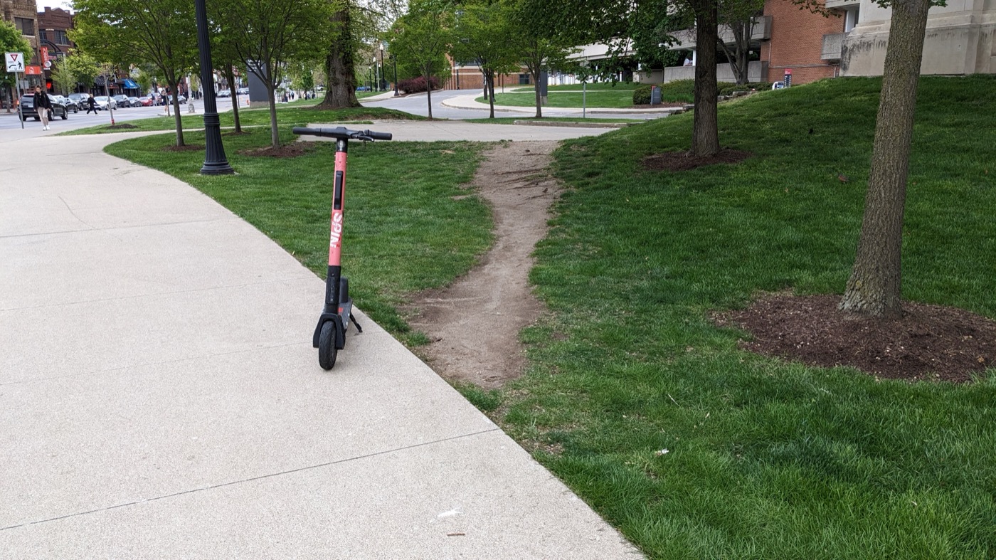
FIG.03 — The route people actually walk, worn into the grass beside the pavement nobody asked for. Most of the design work was deleting the pavement.
![[src]](https://en.wikipedia.org/wiki/File:Desire_path_-_52849400711.jpg)
[src]
The second is to surface progress before the real payoff arrives. A passed exam is months out; nobody runs on that. So we add intermediate markers — diagnostic checks, checkpoint assessments, small signals that you're moving — that show the learner where they are without faking where they're going.
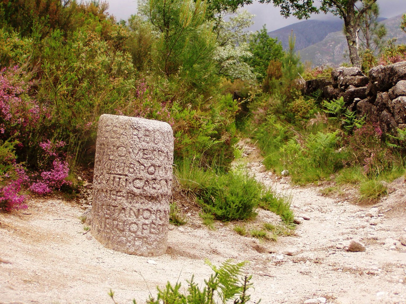
FIG.04 — A Roman milestone on the old road to Braga, still counting the distance out. A marker tells you how far you've come without pretending the journey is over.
![[src]](https://en.wikipedia.org/wiki/File:Geira_Milha_XXIX_caminho.jpg)
[src]
The two moves pull in opposite directions: one strips things out, the other adds them in. But both shrink the felt distance between effort and reward, while leaving the difficulty of the learning itself untouched.
The early app failed at both. The home screen offered too many ways to start — create a course, read a source, chat with an AI tutor, answer test questions — so users decided rather than learned (move one). Inside the test loop, you'd answer ten questions before any sign you were moving (move two). We cut to one path through the material and shortened the loop to five questions plus a short open-ended assessment. The checkpoint arrives sooner. The payoff moved forward.
None of this is science. Deciding how much friction to keep, and where to place the feedback so it lands, is closer to an art — and an art we have not finished mastering yet. We get it wrong, then adjust, then get it wrong in another way. Whether Only Ever becomes a company comes down mostly to whether we get that calibration right.
Whether the app teaches anything — whether Only Ever becomes a company at all — comes down to whether we calibrate the two moves right. We won't know for months. Neither will the user.